UX Design: What Is Mobile-First Design and Why Should You Learn It? was originally published on Springboard.
Thanks to the digital transformation, the whole world—businesses and consumers alike—is now online. This means that more than half of the global population is connected to the internet, with an astonishing 93% accessing the web via mobile devices.
Mobile devices are now the device of choice for accessing the internet, as they are accessible, cheaper than computers, and easy to use. The importance of designing websites properly for mobile users cannot be overstated, and this is where mobile-first design comes in.
What Is Mobile-First Design?

Mobile-first design can be defined as designing a product for mobile users before expanding to a design for tablet and desktop users. This implies that a designer would begin the design process by prototyping how the product would look on a mobile device and then adding additional elements as the screens get bigger.
This kind of design hasn’t always been the norm. In the past, websites were first designed for desktops, then elements were either taken away or sized down as screen sizes reduced. This was first known as the graceful degradation philosophy before later morphing to responsive web design.
The term mobile-first first came onto the scene in 2010, thanks to the then CEO of Google, Eric Schmidt. During a conference, Schmidt predicted that mobile would soon be the most popular way to provide many services to consumers, and hence the best way to get mobile architecture right was to go mobile-first.
If current statistics are anything to go by, he couldn’t have been more right. The use of mobile phones has been on a steady rise over the last five years—concurrent with the slow decline of desktop use—allowing mobile-first design to take center stage.
A mobile-first strategy means focusing your attention on where most of your product’s users are, along with what will potentially be your most significant profits.
3 Reasons Why Mobile-First Design Is Important

As the majority of the internet is accessed from mobile devices, it only makes sense to focus most of the attention on designing for that market. Mobile-friendly websites have never been in higher demand, so it’s prime time to learn and incorporate the strategy into your designs.
- Mobile-first is important because Google’s algorithm ranks mobile-friendly sites higher. It’s not just users that love mobile—Google does too. The search engine titan now uses mobile-friendliness as one of its ranking factors for mobile searches. This means that websites designed mobile-first have a better chance of a top ranking and potentially bringing in more conversions.
- Mobile-first is important because it forces a web designer to focus only on the essentials, thus providing a better user experience on mobile devices. Since the web designer has less space to play with, they must focus on the content without unnecessary user interface (UI) elements. Your users will have a better experience on your site because there are fewer distractions and the layout is easily accessible.
- Mobile-first is important because it strengthens desktop and tablet website design. Designing for smartphone devices is a content-first approach. When you expand to bigger screen sizes, you’ll know what is essential and expand on that without losing the foundation of what’s most important.
4 Tips That Contribute To a Good Mobile-First Design

1. Prioritize Content Before Other Elements
When it comes to designing for mobile, presenting the content comes before anything else. Any additional elements might clutter the smaller screen and bring down the user experience. This implies that only the essential elements are shown on a mobile website. In mobile-first design, there is often a visual hierarchy based on the importance of each element.

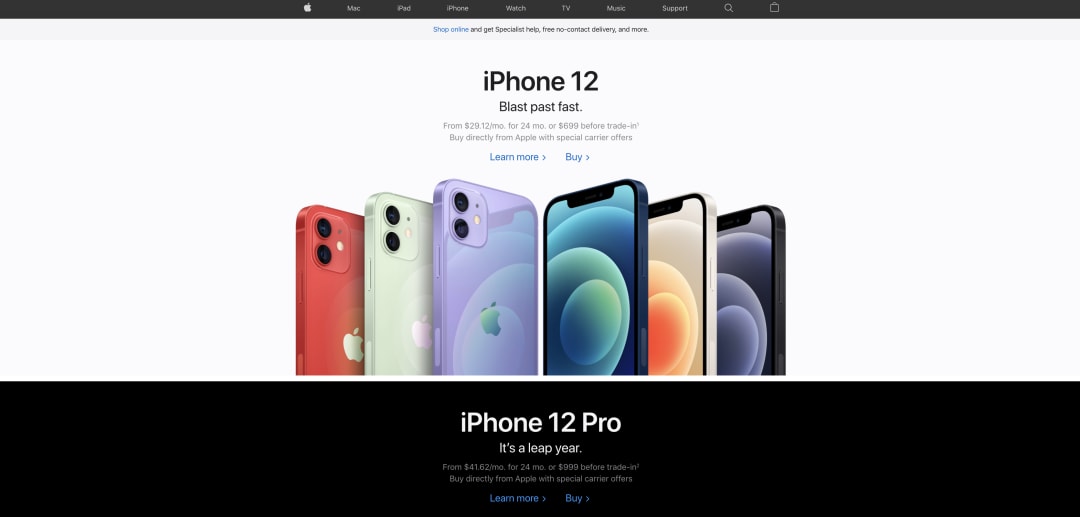
Apple’s web pages are a great example of a simplified, content-first design. When you visit their pages, including their desktop versions, you’ll only view the essential information you need with little distractions.
2. Make All The Page Elements Visible and Consistent
Here’s a stat to keep in mind: 57% of users will not recommend a business if its mobile user interface is poorly designed. That’s how much a website’s design can affect your bottom line.
Because the screen size is small, you’ll need to use a font size that is big enough to read on the device. Mobile-first web design also means that you’ll need to use contrasting color schemes and clean design to make your website easy to peruse. Your CTAs must also be bold and eye-catching—otherwise, you’ll lose valuable leads.
Ads, pop-ups, unnecessary images and video, and other intrusive elements are not good for mobile design. Good mobile-first design is simple—you’re only showing your users what they are on the page to see. A simple design focuses the user on the content that matters.

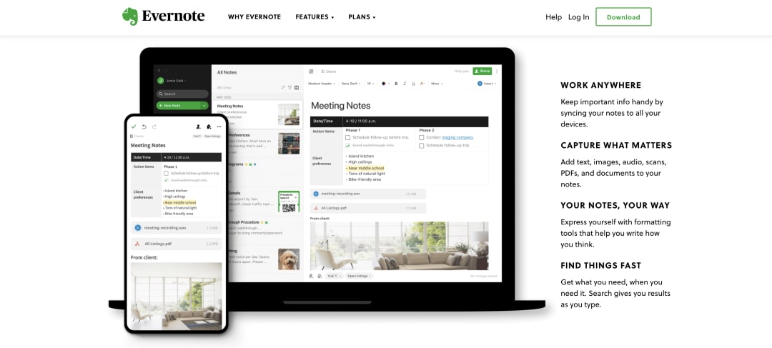
Evernote does a great job at this, with a clear CTA close to the top of the page, readable fonts, and a color palette consistent with the brand.
3. Make Your Pages Easy To Navigate
While you might have plenty of space for navigation menus on a desktop, there’s a lot less room on mobile. An easy navigation system helps your users move seamlessly between your pages, keeping them on your site longer and improving the overall user experience.
When designing for mobile, you’ll have to condense the navigational menu items to as few options as possible. All of the secondary elements can be combined into conveniently placed navigation buttons. Hamburger menus and combo menus are excellent ways to achieve this.

Both the desktop and mobile versions of Typeform have a very simplified but easy-to-access navigation system.
4. Ensure Your Pages Load Fast
Page loading significantly affects any website’s user experience and its SEO ranking. Many users don’t have the time to wait, so slower load times will inevitably lead to page abandonment.

That’s why it’s critical to eliminate unnecessary elements that may slow your loading speed. You can also compress your multimedia elements, use lazy loading, and switch to the HTTPS protocol, all of which will help your pages load faster.
Ready to switch careers to UI/UX Design?
Springboard offers a comprehensive UI/UX design bootcamp. No design background required—all you need is an eye for good visual design and the ability to empathize with your user. In the course, you’ll work on substantial design projects and complete a real-world externship with an industry client. After nine months, you’ll graduate with a UI/UX design mindset and a portfolio to show for it.
Check out Springboard’s UI/UX Design Career Track to see if you qualify.
Not sure if UI/UX design is the right career for you?
Springboard now offers an Introduction to Design course. Learn what designers do on the job by working through a project with 1-on-1 mentorship from an industry expert. Topics covered include design tools, research, sketching, designing in high fidelity, and wireframing.
Check out Springboard’s Introduction to Design Course—enrollments are open to all!
The post UX Design: What Is Mobile-First Design and Why Should You Learn It? appeared first on Springboard Blog.


